Graphical User Interface

This is what the EO Time Series Viewer’s interface looks like when opening it.
Note
Just like in QGIS, many parts of the GUI are adjustable panels. You can arrange them as tabbed, stacked or separate windows. Activate/Deactivate panels under
Time Series
This window lists the individual input raster files of the time series.
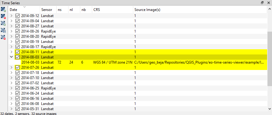
Date corresponds to the image acquisition date as automatically derived by the EO TSV from the file name. Checking
 or unchecking
  the box in the date field will include or exclude the respective image from the display
Sensor shows the name of the sensor as defined in the Sensors / Products tab
ns: number of samples (pixels in x direction)
nl: number of lines (pixels in y direction)
nb: number of bands
image: path to the raster file
You can add new rasters to the time series by clicking  Add image to time series.
Remove them by selecting the desired rows in the table (click on the row number) and pressing the
Add image to time series.
Remove them by selecting the desired rows in the table (click on the row number) and pressing the  Remove image from time series button.
Tip
If you have your time series available as one large raster stack, you can import this file via
Tip
Click to load a small example time series.
Sensors / Products
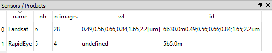
The EO Time Series Viewer automatically assesses different characteristics of the input images (number of bands, geometric resolution etc.) and combines identical ones into sensor groups (or products). Those are listed as follows in the Sensor / Products window:
nameis automatically generated from the resolution and number of bands (e.g. 6bands@30.m). This field is adjustable, i.e. you can change the name by double-clicking into the field. The here defined name will be also displayed in the Map View and the Time Series table.nb: number of bandsn images: number of images within the time series attributed to the according sensorwl: comma separated string of the (center) wavelength of every band and [unit]id: string identifying number of bands, geometric resolution and wavelengths (primary for internal use)
Toolbar
Button |
Function |
|---|---|
|
Add images to the time series |
|
Add Time Series from CSV |
|
Remove all images from Time Series |
|
Save Time Series as CSV file |
|
Add vector data file |
|
Synchronize with QGIS map canvas |
|
Add maps that show a specified band selection |
|
Refresh maps |
|
Pan map |
|
Zoom into map |
|
Zoom out |
|
Zoom to pixel scale |
|
Zoom to maximum extent of time series |
|
Center map on clicked locations |
|
Identify Pixels and Features |
|
Identify cursor location values |
|
Identify raster profiles to be shown in a Spectral Library |
|
Identify pixel time series for specific coordinate |
|
Select Features |
|
Start Editing Mode |
|
Save Edits |
|
Draw a new Feature |


Note
Only after  Identify Pixels and Features is activated you can select the other identify tools
(
Identify Pixels and Features is activated you can select the other identify tools
( ,
,  ,
,  ). You can activate them all at once as well as of them,
in case of the latter variant clicking in the map has no direct effect (other than moving the crosshair, when activated)
). You can activate them all at once as well as of them,
in case of the latter variant clicking in the map has no direct effect (other than moving the crosshair, when activated)
Map Visualization
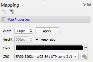
Map Properties
In the map properties box you can specify Width and Height, as well as background Color and the CRS of the single map canvases.
Click Apply to apply changes. By default the keep ratio option is checked, i.e. height will be the same as width. In case
you want to have unequally sized views, deactivate this option.
Map Views
A map view is a row of map canvases that show the time series images of different sensors/product in the same band combination, e.g. as “True Color bands”. The map view panel allows to add or remove map views and to specifiy how the images of each sensor are to be rendered.
You can add new Map Views using the
 button. This will create a new row of map canvases. Remove a map view with the
  button.
In case the Map View does not refresh correctly, you can ‘force’ the refresh using the
 button (which will also apply all the render settings).
Access the settings for individual Map Views by clicking in the mapview
You can use the
 button to highlight the current Map View selected in the dropdown menu (respective image chips will show red margin for a few seconds).
For every Map View you can alter the following settings:
Hide/Unhide the Map View via the
 Toggle visibility of this map view button.
Activate/Deactivate Crosshair via the
 Show/hide a crosshair button. Press the arrow button next to it to enter
the Crosshair specifications
Show/hide a crosshair button. Press the arrow button next to it to enter
the Crosshair specifications  , where you can customize e.g. color, opacity, thickness, size and further options.
You may rename the Map View by altering the text in the Name field.
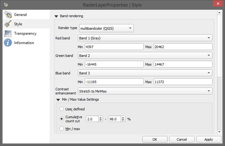
Layer representation:
Similar to QGIS you can change the visual representation of raster or vector layers in the layer properties. To open them, right-click on the layer you want to alter and select
Cursor Location Values
This tools lets you inspect the values of a layer or multiple layers at the location where you click in the map view. To select a location (e.g. pixel or feature)
use the Select Cursor Location button and click somewhere in the map view.
The Cursor Location Value panel should open automatically and list the information for a selected location. The layers will be listed in the order they appear in the Map View. In case you do not see the panel, you can open it via .
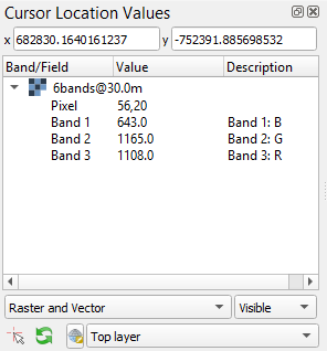
By default, raster layer information will only be shown for the bands which are mapped to RGB. If you want to view all bands, change the Visible setting to All (right dropdown menu). Also, the first information is always the pixel coordinate (column, row).
You can select whether location information should be gathered for All layers or only the Top layer. You can further define whether you want to consider Raster and Vector layers, or Vector only and Raster only, respectively.
Coordinates of the selected location are shown in the x and y fields. You may change the coordinate system of the displayed coordinates via the
 Select CRS button (e.g. for switching to lat/long coordinates).
Profile Visualization
Example: Temporal NDSI (Normalized Difference Snow Index) profile for 2 locations using Landsat 7 and 8 images.
Temporal Profiles
The Temporal Profiles panel lets you visualize temporal profiles.
On the left side you can switch between the  profile and the coordinates
  page. The latter
lists all coordinates of selected or imported profile locations.
page. The latter
lists all coordinates of selected or imported profile locations.
- Adding and managing a temporal profile:
You can use the
button to click on a location on the map an retrieve the temporal profile, or
in the toolbar select + .Mind how the selected pixel now also appears on the coordinates
page!If you select further pixels (
), they will be listed in the coordinates page,
but not automatically visualized in the plot.Use
 to create an additional plot layer, and double-click in the Coordinate field in order to select the
desired location (so e.g. the newly chosen pixel) or just change the location in the current plot layer.
to create an additional plot layer, and double-click in the Coordinate field in order to select the
desired location (so e.g. the newly chosen pixel) or just change the location in the current plot layer.Similarly, you can change the sensor to be visualized by double-clicking inside the Sensor field and choosing from the dropdown.
Click inside the Style field to change the visual representation of your time series in the plot.
Remove a time series profile by selecting the desired row(s) and click
 .
.The DN or Index field depicts which values will be plotted.
Here you may select single bands (e.g.
b1for the first band)or you can calculate indices on-the-fly: e.g. for the Landsat images in the example dataset the expression
(b4-b3)/(b4+b3)would return the NDVI.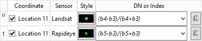
Example of visualizing the NDVI for the same location for different sensors (example dataset).
You can also move the map views to a desired date from the plot directly by right-click into plot
Note
The EO TSV won’t extract and load all pixel values into memory by default in order to reduce processing time (only the ones required). You can manually load all the values by clicking the
 Load missing band values button
on the coordinates page.
Load missing band values button
on the coordinates page.- Importing or exporting locations:
You can also import locations from a vector file instead of collecting them from the map: Go to the coordinates
page
and add locations via the  button.
If you want to save your locations, e.g. as shapefile or CSV, click on
 .
.
Spectral Profiles
The spectral library view allows you to visualize, label and export spectral profiles.
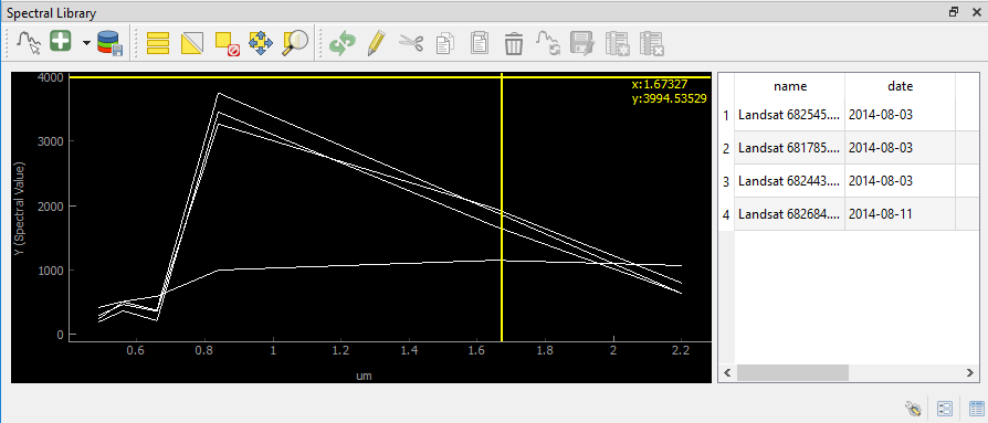
Use the
 Select a spectrum from a map button to extract and visualize a pixels profile
(by clicking on a pixel on the map).
Select a spectrum from a map button to extract and visualize a pixels profile
(by clicking on a pixel on the map).You can add a selected spectrum to your spectral library by clicking on
 .
.The gathered spectra are listed in the table on the right. For every spectrum additional metadata will be stored, e.g. the date, day of year and sensor.
When the
 button is activated, the profile will be directly added to the library after clicking on a pixel.
Change the display style (color, shape, linetype) in the Spectral Library Properties, which can be accessed via the
 button in the lower right.
Note
- The spectral library table behaves quite similar to the attribute table you know from QGIS:
You can edit the content by entering the editing mode

You can add further information by adding fields via the
 button (e.g. different class labels).
Remove them with
button (e.g. different class labels).
Remove them with  , accordingly.
Double-click into a desired field to change its content
Remove spectra by selecting the desired row(s) in the table and click
